
Miniature photography for beginners part 2: Taking the photo
This is part two of this series and here we will go through some basic theory, how to set up your shot and build your scene. If you have not read part 1 it is highly recommended, but not necessary, that you do before reading this.

The basic set up in action.
First we need to talk a little bit about the theory behind these photos. To make them look “cinematic” (or something like that) I stage the photo in three different sections. These are the foreground, the middleground and the background. The foreground is what is closest to the camera and could be anything from a miniature to a fence, usually it’s something small and placed off to the side as we don’t want to obscure the rest of the scene. Most of the middleground is usually in focus and this is where we will place our subject. The subject is the most important part of the photo, the main character if you wish. This could be a single miniature or a full unit. There can be other elements in the middleground too, such as houses or trees or more miniatures. Lastly we have the background, this is furthest in the back and usually there’s some sky in it but it could also contain a tree line or the ocean.
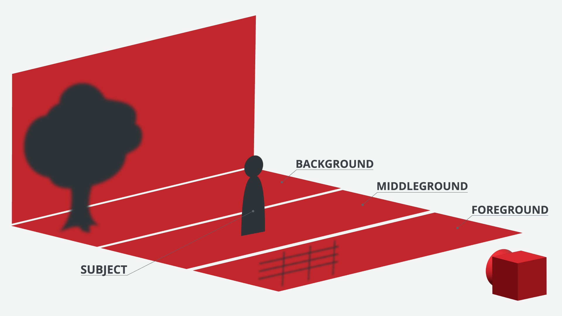
Now what do we need all these sections for? The main purpose is to create depth in the photo which in turn adds to that cinematic feel. It will also create depth and areas of interest in the photo. It can also be used to tell a story within the photo as it can answer questions like “where are we?” or “who are these fighting?”. Lastly it can also add some visual interest by introducing new elements or adding new colours to the photo
The scene and the photo
The first thing I do is to set up my phone, make sure it's level and looks straight forward. Now we can start building our scene based on the theory from above.
To keep it simple and straightforward here let's say we want to take a photo of a battle line of fierce viking warriors on the battlefield. So to start I pop down my chosen miniatures in the middleground as these are our subject and we want these to be the focus of the photo. As you can see I have placed both miniatures and smartphone on some books, this is because we need some difference in height. The miniatures should be level with the camera lens which is impossible to achieve if both the miniatures and the camera would be placed directly on the table.

Some kitchen sink realism for you.
I usually place miniatures, full units, houses and other terrain at an angle. Looking straight at things makes them flat and we lose the depth that we want in the photo. So as you can see above I have placed my unit at a slight angle towards the camera. What angle to use depends on the miniatures really but as these are a shieldwall I want to show off their shields so I angle these towards the camera. You also want to avoid the miniatures looking like they are standing in neat rows and leaving wide gaps of the background peeking through, it takes away from the illusion of a mass of warriors charging towards us.
Now take a look at how that looks in your camera. This is where our guidelines come in handy. If you followed the setup of Lightroom from part 1 you should see a grid across your screen. This is called the rule of thirds as it divides the image in three horizontal parts and three vertical parts. This is helpful when we compose our image and will be more helpful in part 3 when we edit our photo. For now try to place your subject in the middle of the image as you can see below. Don’t get too close, leave some space around the unit, it is much simpler to crop the image later than redo the whole shot.

The interface within the app.
Now it’s time to introduce the most important part in all of this: your lights. The lights should be placed off to around 45 degrees from the camera and 45 degrees off from the table and aimed directly at the miniatures. The light should be as close as possible to the miniatures without showing in the image. And don’t forget to turn off any other lights that might affect the scene, like a ceiling light. Here’s an example of how my set up on the kitchen table looks like with the lights on and ceiling light off.

The light to the right was much brighter than the one on the left so I had to move this further away to match the light sources and not overexpose the image.
The placing of the lights is worth experimenting a bit with. Generally placing it further off to the side and higher will create more shadows while keeping it closer to the table and to the camera will create less. Going too far either way will create quite unrealistic results though. Generally we want to keep our lights close to the scene but in my example I found out that one of the lights was simply too bright so I had to move it further away from the scene to not overexpose the image.
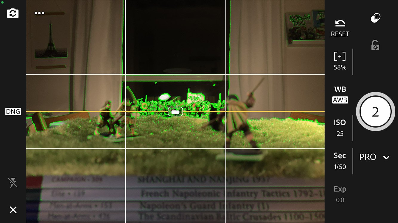
Now it’s time to set your focus. This is done by simply pressing and holding where you want the focus to be, in our example here just chose the middle of the unit. A yellow box will appear on the screen that shows the area that you pointed at. There will also be green outlines around objects, this shows what is in focus. There is a good chance that your image will have the wrong exposure now, i.e. be too dark or too bright. Fixing the exposure can be done by adjusting the shutter speed.
Press Sec and pull the slider down. This increases the shutter speed and lets less light into the camera making the image darker. If you pull the slider up you will decrease the shutter speed letting more light into the camera and make the image brighter. If you have decreased the shutter speed as much as you can but the image is still too dark you can increase the ISO to digitally lighten up the image. Increasing the ISO will add digital noise to the image so be careful with this. It is unlikely that your image will be too bright with the shutter speed increased to max but if that’s the case try to move your lights further away from the scene.
Remember that we will edit this photo later so it is possible to make it darker or lighter there even though it is always best to have good exposure from the start. Here you can see how it looks in the example when we have added our light, set focus and adjusted our exposure. It can be hard to see exactly how the exposure is without taking a couple of photos as what is represented through the viewfinder isn’t always correct.

The green lines shows which parts of the image is in focus, it can also be a little bit annoying and unfortunately there is no way of turning it off.
Now it’s time to build out the rest of the scene, let's start with the foreground. First we need something here that will obscure the bases of our unit and serve as a believable ground. There’s a lot of different things you could use for this like rocks, tufts, a wargaming mat or even other miniatures. What I’ve found works best are scenery mats - basically it’s an A4-size paper with scenery already glued to it, I talked more about these in part 1. This is simply laid down in front of the camera. I usually make sure there is a little slope from the camera up to the miniatures with this to help a bit with the perspective. This is really all you need in the foreground but you could add something more like a fence, tree stumps, casualties or low bushes, just remember not to cover up to much of the image. I like to add an enemy to whoever the subject of the image is and here it seemed fitting to add some Welsh archers losing a few shots into the charging shieldwall. I tried to keep these miniatures within the leftmost third of the grid and one to the right so they don't block too much of the shieldwall. It’s always good to have some tufts, rocks or sticks at hand when fixing the foreground, they might come in handy covering up bases or other things.
Below you can see a shot of the setup and how it looks in the camera this far.
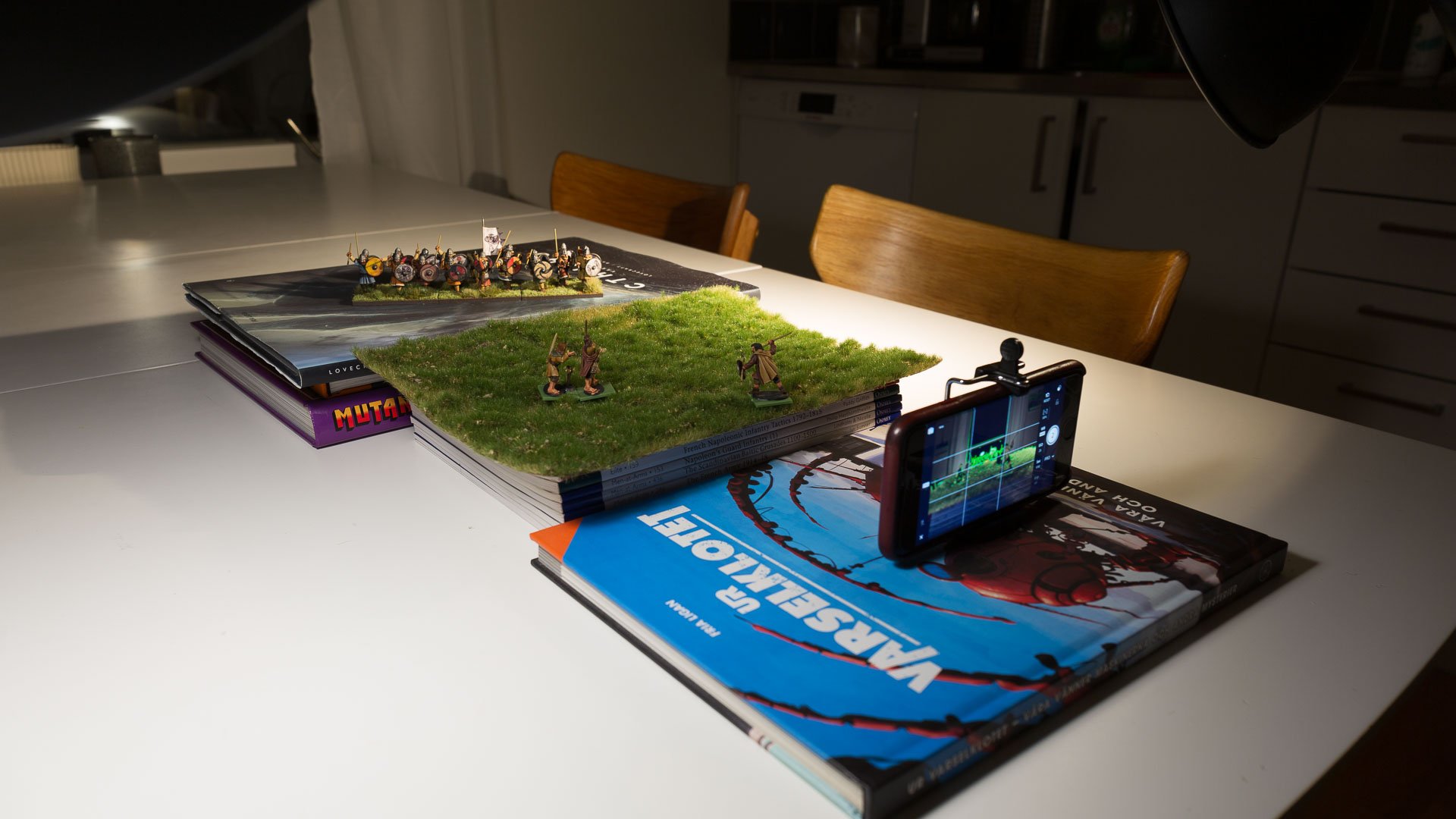
Now it’s time to take care of the background. I use blu-tac to fasten my background on any suitable flat surface that you can set up behind your miniatures. For me that is the lid of a box I have, this was then leaned against a bread box. You’ll might have to move this closer or further away depending on how you want it to look but make sure it covers the whole subject and a bit more on either side of it. Below you can see the final setup on the table:

The final setup with everything in place.
After everything is set up you might have to go back and adjust things in the scene. Maybe the angle of the unit needs to be more straight towards the camera or the light must be higher up to add more light to the background. Maybe you want to adjust your focus or increase the exposure. Maybe some parts of the image aren't enough out of focus and they will have to be moved further away from the camera. There are a number of things and settings to play around with here and my tip is that you do exactly that. Just remember to take photos all of the time so you can see what the end result will be.
My final shot ended up looking like below and in the next part we will see how we can edit this within the Lightroom app.
If you have any questions please leave a comment below and I’ll try to answer as best I can.
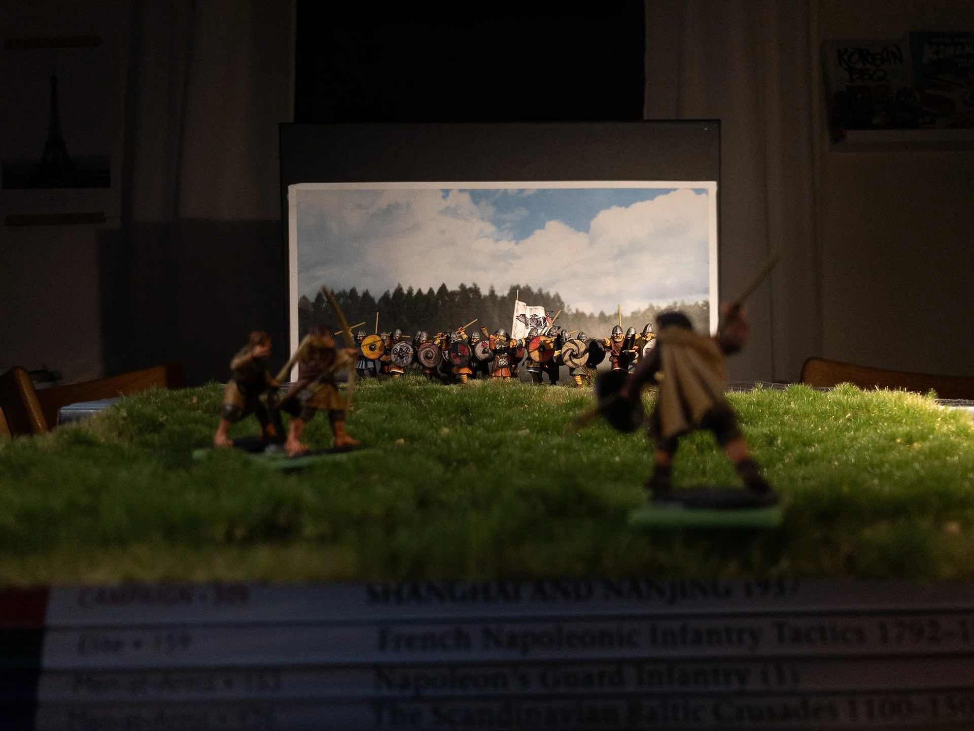
The shot straight out of the phone.
Did you miss the first part or want to go straight to editing?

Part 1: What you need
If you have a smartphone you are ready to start.

Part 3: Editing the photo
Time to finalize the image for publication.